Visualizing prediction error
In machine learning papers, we often need to compare the prediction error/accuracy of different algorithms. This post explains how to do that using data visualizations that are easy to read/interpret.
Example: gradient descent learning of binary classification models
Classification is a machine learning problem that has been widely studied for the last few decades. Binary classification is the special case when there are two possible classes to predict (spam vs normal email, cat vs dog in images, etc). To evaluate the prediction accuracy of learned binary classification models, we often use the Area Under the ROC Curve, because it allows fair comparison, even when the distribution of labels is unbalanced (for example, 1% positive/spam and 99% negative/normal email).
In our recent JMLR’23 paper, we proposed the AUM loss function, which can be used in gradient descent learning algorithms, to optimize ROC curves. Recently I did a computational experiment to compare this loss function to others, via the following setup.
- We were motivated by the following question: Can gradient descent using the AUM loss result in faster computation of a model with good generalization properties? (large AUC on held-out data)
- We wanted to compare the AUM loss to the standard Logistic/Cross-Entropy loss used in classification, as well as the all pairs squared hinge loss which is a popular relaxation of the Mann-Whitney U statistic (and therefore a surrogate for ROC-AUC, for more info see my paper with Kyle Rust).
- We analyzed four different image classification data sets, in which each had 10 classes. So in each data set we converted to a binary problem, by using the first class (0) as the negative/0 class, and using all of the other classes as the positive/1 class. So each data set had about 10% negative and 90% positive labels.
- Data sets had different numbers of features, so were down-sampled to different sizes, in order to get train times which were similar between data sets. For example STL10 had the largest number of features (27648), so had the smallest train set; MNIST with only 784 features had the largest train set.
- Source code used to compute the result, for a given loss function and learning rate, is in data_Classif.py
- We tried a range of learning rates,
10^seq(-4,5), and three different loss functions, as can be seen in data_Classif_batchtools.R. - For each algorithm, data set, random seed, and learning rate, we used torch to initialize a random linear model, and then did 100000 epochs of gradient descent learning with constant step size (learning rate).
- Then for each algorithm, data set, and random seed, we select only the epoch/iteration and step size that achieved the max AUC on the validation set.
The results can be read from data_Classif_batchtools_best_valid.csv, as shown in the code below:
library(data.table)
(best.dt <- fread("../assets/data_Classif_batchtools_best_valid.csv"))
##        data.name     N         loss  seed    lr step_number   loss_value       auc
##           <char> <int>       <char> <int> <num>       <int>        <num>     <num>
##  1:      CIFAR10  5623          AUM     1 1e+00          45 5.196870e+01 0.8220866
##  2:      CIFAR10  5623          AUM     2 1e+04          40 5.412949e+05 0.8192649
##  3:      CIFAR10  5623          AUM     3 1e+05          55 4.929346e+06 0.8197657
##  4:      CIFAR10  5623          AUM     4 1e+03          29 4.944706e+04 0.8211118
##  5:      CIFAR10  5623     Logistic     1 1e+01          63 1.137827e+02 0.8084200
##  6:      CIFAR10  5623     Logistic     2 1e+05           7 6.490934e+05 0.8177584
##  7:      CIFAR10  5623     Logistic     3 1e+01          12 1.027919e+02 0.8096859
##  8:      CIFAR10  5623     Logistic     4 1e+04          13 1.202190e+05 0.8072651
##  9:      CIFAR10  5623 SquaredHinge     1 1e+03           1 1.744445e+07 0.7710211
## 10:      CIFAR10  5623 SquaredHinge     2 1e+00           1 1.163525e+03 0.7354803
## 11:      CIFAR10  5623 SquaredHinge     3 1e+00           8 2.199932e+09 0.7309735
## 12:      CIFAR10  5623 SquaredHinge     4 1e+05           1 1.974501e+11 0.7753759
## 13: FashionMNIST 10000          AUM     1 1e+02          61 1.475747e+02 0.9817591
## 14: FashionMNIST 10000          AUM     2 1e+01          70 1.553757e+01 0.9816031
## 15: FashionMNIST 10000          AUM     3 1e+05          75 1.575107e+05 0.9818049
## 16: FashionMNIST 10000          AUM     4 1e+02          67 1.507560e+02 0.9820311
## 17: FashionMNIST 10000     Logistic     1 1e+00         397 8.089332e+00 0.9408162
## 18: FashionMNIST 10000     Logistic     2 1e+02        1125 6.918590e+02 0.9405631
## 19: FashionMNIST 10000     Logistic     3 1e+02        1213 6.432875e+02 0.9414778
## 20: FashionMNIST 10000     Logistic     4 1e+03         931 7.283925e+03 0.9408533
## 21: FashionMNIST 10000 SquaredHinge     1 1e+01          71 4.527093e-02 0.9781764
## 22: FashionMNIST 10000 SquaredHinge     2 1e+01          94 1.379243e-01 0.9808044
## 23: FashionMNIST 10000 SquaredHinge     3 1e+01          47 5.958961e-02 0.9759747
## 24: FashionMNIST 10000 SquaredHinge     4 1e+01          23 4.981834e-02 0.9650889
## 25:        MNIST 18032          AUM     1 1e+01          28 3.038475e+00 0.9967078
## 26:        MNIST 18032          AUM     2 1e+03          36 3.333767e+02 0.9967440
## 27:        MNIST 18032          AUM     3 1e+03          29 2.631508e+02 0.9969475
## 28:        MNIST 18032          AUM     4 1e+02          34 2.607299e+01 0.9970675
## 29:        MNIST 18032     Logistic     1 1e+00       45322 7.714394e+00 0.9899026
## 30:        MNIST 18032     Logistic     2 1e+00       44783 7.678055e+00 0.9898945
## 31:        MNIST 18032     Logistic     3 1e+00       44620 7.705319e+00 0.9899023
## 32:        MNIST 18032     Logistic     4 1e+00       44829 7.701845e+00 0.9901057
## 33:        MNIST 18032 SquaredHinge     1 1e+02         215 1.577004e-02 0.9964240
## 34:        MNIST 18032 SquaredHinge     2 1e+02         178 1.847402e-02 0.9968762
## 35:        MNIST 18032 SquaredHinge     3 1e+02         158 1.802334e-02 0.9968006
## 36:        MNIST 18032 SquaredHinge     4 1e+02         225 1.207210e-02 0.9969883
## 37:        STL10  1778          AUM     1 1e+01          22 2.455220e+03 0.8432584
## 38:        STL10  1778          AUM     2 1e+00          21 2.232408e+02 0.8457865
## 39:        STL10  1778          AUM     3 1e+05          23 2.420980e+07 0.8483989
## 40:        STL10  1778          AUM     4 1e+00          13 2.384768e+02 0.8461657
## 41:        STL10  1778     Logistic     1 1e+03          17 1.080996e+05 0.8076966
## 42:        STL10  1778     Logistic     2 1e+02           2 6.999322e+03 0.8243258
## 43:        STL10  1778     Logistic     3 1e+03           5 1.096540e+05 0.8046910
## 44:        STL10  1778     Logistic     4 1e+01          14 1.213560e+03 0.8106742
## 45:        STL10  1778 SquaredHinge     1 1e-01           1 5.429723e+03 0.7627528
## 46:        STL10  1778 SquaredHinge     2 1e+05           1 2.601109e+16 0.7589888
## 47:        STL10  1778 SquaredHinge     3 1e+01           6 4.489175e+34 0.7541152
## 48:        STL10  1778 SquaredHinge     4 1e-01           1 2.382808e+02 0.8266292
##        data.name     N         loss  seed    lr step_number   loss_value       auc
Easy dot plot visualization
A visualization method which is simple to code is shown below:
library(ggplot2)
ggplot()+
  geom_point(aes(
    auc, loss),
    data=best.dt)+
  facet_grid(. ~ data.name)
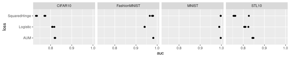
The plot above shows four dots for each loss and data set. Already we
can see that loss=AUM tends to have the largest auc values, in each
data set. Rather than showing the four data sets using the same X axis
scale, we can show more subtle differences, by allowing each data set
to have its own X axis scale, as below.
ggplot()+
  geom_point(aes(
    auc, loss),
    data=best.dt)+
  facet_grid(. ~ data.name, scales="free", labeller=label_both)
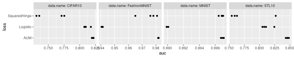
Above we see each data set has its own scale, but some of the tick marks are not readable. This can be fixed by specifying non-default panel spacing values in the theme, as below.
ggplot()+
  geom_point(aes(
    auc, loss),
    data=best.dt)+
  facet_grid(. ~ data.name, scales="free", labeller=label_both)+
  theme(
    panel.spacing=grid::unit(1.5, "lines"))
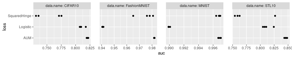
In the plot above there is now another issue: the last X tick mark goes off the right edge of the plot. To fix that we need to adjust the plot margin, as below.
ggplot()+
  geom_point(aes(
    auc, loss),
    data=best.dt)+
  facet_grid(. ~ data.name, scales="free", labeller=label_both)+
  theme(
    plot.margin=grid::unit(c(0,1,0,0), "lines"),
    panel.spacing=grid::unit(1.5, "lines"))
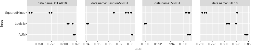
The plot above looks like a reasonable summary of the results, but the labels could be improved.
- We could explain more details about each algorithm in the Y axis labels.
- We could simplify the panel/facet variable names,
data.nameabove, to simplyData, and addNfor each. - We could use the more common capital
AUCrather than lowerauc, and explain that it is the max on the validation set.
loss2show <- rev(c(
  Logistic="Logistic/Cross-entropy\n(classic baseline)",
  SquaredHinge="All Pairs Squared Hinge\n(recent alternative)",
  AUM="AUM=Area Under Min(FP,FN)\n(proposed complex loss)",
  NULL))
Loss_factor <- function(L){
  factor(L, names(loss2show), loss2show)
}
best.dt[, `:=`(
  Loss = Loss_factor(loss),
  Data = data.name
)]
ggplot()+
  geom_point(aes(
    auc, Loss),
    data=best.dt)+
  facet_grid(. ~ N + Data, scales="free", labeller=label_both)+
  scale_x_continuous(
    "Max validation AUC (4 random initializations)")+
  theme(
    plot.margin=grid::unit(c(0,1,0,0), "lines"),
    panel.spacing=grid::unit(1.5, "lines"))
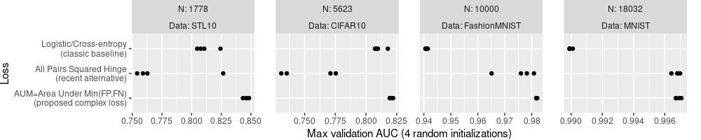
Note the Loss names in code above is arranged to be consistent with
their display in the plot above: the Loss column factor levels come
from loss2show, and are used to determine the order of display of
the tick marks in the Y axis.
Similarly, the facets/panels are ordered by the first facet variable,
N (smallest N for STL10 on the left, largest N for MNIST on the
right). This order is different than previous plots, which had facets
in alphabetical order (CIFAR10 left, STL10 right). To display an
alternative facet/panel order, you would have to create a factor
variable with the levels in the desired order, similar to what we did
with Loss values for the Y axis above. (exercise for the reader)
Display mean and standard deviation
Whereas in the previous section we displayed each random seed as a different dot, below we compute and plot the mean and SD over random seeds. And while we are at it, we can also compute the range (min and max), for the AUC as well as for the number of gradient descent epochs (which is the same as the number of steps here, since we used full gradient method, batch size = N).
(best.wide <- dcast(
  best.dt,
  N + Data + Loss ~ .,
  list(mean, sd, length, min, max),
  value.var=c("auc","step_number")))
## Key: <N, Data, Loss>
##         N         Data                                               Loss  auc_mean step_number_mean       auc_sd
##     <int>       <char>                                             <fctr>     <num>            <num>        <num>
##  1:  1778        STL10 AUM=Area Under Min(FP,FN)\n(proposed complex loss) 0.8459024            19.75 0.0021060041
##  2:  1778        STL10      All Pairs Squared Hinge\n(recent alternative) 0.7756215             2.25 0.0341884983
##  3:  1778        STL10         Logistic/Cross-entropy\n(classic baseline) 0.8118469             9.50 0.0086704638
##  4:  5623      CIFAR10 AUM=Area Under Min(FP,FN)\n(proposed complex loss) 0.8205572            42.25 0.0012836241
##  5:  5623      CIFAR10      All Pairs Squared Hinge\n(recent alternative) 0.7532127             2.75 0.0232189982
##  6:  5623      CIFAR10         Logistic/Cross-entropy\n(classic baseline) 0.8107824            23.75 0.0047546328
##  7: 10000 FashionMNIST AUM=Area Under Min(FP,FN)\n(proposed complex loss) 0.9817996            68.25 0.0001768922
##  8: 10000 FashionMNIST      All Pairs Squared Hinge\n(recent alternative) 0.9750111            58.75 0.0069031630
##  9: 10000 FashionMNIST         Logistic/Cross-entropy\n(classic baseline) 0.9409276           916.50 0.0003887880
## 10: 18032        MNIST AUM=Area Under Min(FP,FN)\n(proposed complex loss) 0.9968667            31.75 0.0001704442
## 11: 18032        MNIST      All Pairs Squared Hinge\n(recent alternative) 0.9967723           194.00 0.0002446508
## 12: 18032        MNIST         Logistic/Cross-entropy\n(classic baseline) 0.9899513         44888.50 0.0001030444
##     step_number_sd auc_length step_number_length   auc_min step_number_min   auc_max step_number_max
##              <num>      <int>              <int>     <num>           <int>     <num>           <int>
##  1:       4.573474          4                  4 0.8432584              13 0.8483989              23
##  2:       2.500000          4                  4 0.7541152               1 0.8266292               6
##  3:       7.141428          4                  4 0.8046910               2 0.8243258              17
##  4:      10.812801          4                  4 0.8192649              29 0.8220866              55
##  5:       3.500000          4                  4 0.7309735               1 0.7753759               8
##  6:      26.297972          4                  4 0.8072651               7 0.8177584              63
##  7:       5.852350          4                  4 0.9816031              61 0.9820311              75
##  8:      30.598203          4                  4 0.9650889              23 0.9808044              94
##  9:     365.820994          4                  4 0.9405631             397 0.9414778            1213
## 10:       3.862210          4                  4 0.9967078              28 0.9970675              36
## 11:      31.379399          4                  4 0.9964240             158 0.9969883             225
## 12:     302.591584          4                  4 0.9898945           44620 0.9901057           45322
In the result table above, we also compute the length to double
check that the mean/etc was indeed taken over the four random seeds.
The code/plot below only uses the mean.
ggplot()+
  theme(
    plot.margin=grid::unit(c(0,1,0,0), "lines"),
    panel.spacing=grid::unit(1.5, "lines"))+
  geom_point(aes(
    auc_mean, Loss),
    shape=1,
    data=best.wide)+
  facet_grid(. ~ N + Data, labeller=label_both, scales="free")+
  scale_x_continuous(
    "Max validation AUC (Mean over 4 random initializations)")
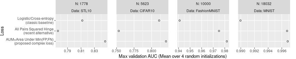
The plot above is not very useful for comparing the different Loss
functions, because it only shows the mean, without showing any measure
of the variance. So we can not say if any Loss is significantly more
or less accurate than any other (we would need error bars or
confidence intervals to do that). We fix that in the code/plot below,
by computing lo and hi limits to display based on the SD.
best.wide[, `:=`(
  lo = auc_mean-auc_sd,
  hi = auc_mean+auc_sd
)]
ggplot()+
  theme(
    plot.margin=grid::unit(c(0,1,0,0), "lines"),
    panel.spacing=grid::unit(1.5, "lines"))+
  geom_point(aes(
    auc_mean, Loss),
    shape=1,
    data=best.wide)+
  geom_segment(aes(
    lo, Loss,
    xend=hi, yend=Loss),
    data=best.wide)+
  facet_grid(. ~ N + Data, labeller=label_both, scales="free")+
  scale_x_continuous(
    "Max validation AUC (Mean ± SD over 4 random initializations)")
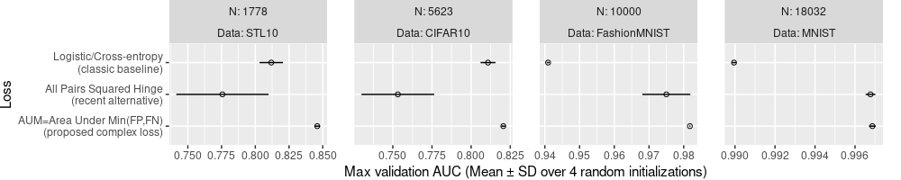
The plot above is much better, because it shows the SD as well as the mean. We can see that AUM is significantly more accurate than the others in all of the data sets, except perhaps MNIST, in which the All Pairs Squared Hinge looks only slightly worse. We could additionally write the values of mean and SD, as below.
ggplot()+
  theme(
    plot.margin=grid::unit(c(0,1,0,0), "lines"),
    panel.spacing=grid::unit(1.5, "lines"))+
  geom_point(aes(
    auc_mean, Loss),
    shape=1,
    data=best.wide)+
  geom_segment(aes(
    lo, Loss,
    xend=hi, yend=Loss),
    data=best.wide)+
  geom_text(aes(
    auc_mean, Loss,
    label=sprintf(
      "%.4f±%.4f", auc_mean, auc_sd)),
    size=3,
    vjust=1.5,
    data=best.wide)+
  facet_grid(. ~ N + Data, labeller=label_both, scales="free")+
  scale_x_continuous(
    "Max validation AUC (Mean ± SD over 4 random initializations)")
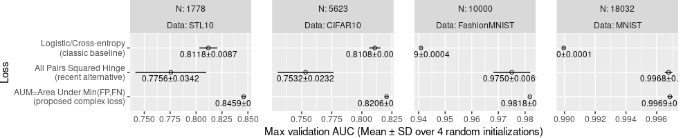
Above, only some of the text is readable, and others go outside of the panels.
To fix this, we can use aes(hjust):
- The default
hjust=0.5, used in the plot above, draws the text centered around the mean value. - if the mean is less than the mid point of the panel X axis, then we
can use
hjust=0which means text will be left justified with the mean value as the limit. In other words, the text will start writing from the mean value, and go to the right of the mean value, but is guaranteed to not go left of the mean value, so it will not go off the panel to the left. - otherwise, we can use
hjust=1which means text will be right justified to the mean value.
To get this scheme to work, we need to compute the mid-point on the X axis (auc) of each panel, which we do in the code below.
best.wide[
, mid := (min(lo)+max(hi))/2
, by=Data]
ggplot()+
  theme(
    plot.margin=grid::unit(c(0,1,0,0), "lines"),
    panel.spacing=grid::unit(1.5, "lines"))+
  geom_point(aes(
    auc_mean, Loss),
    shape=1,
    data=best.wide)+
  geom_segment(aes(
    lo, Loss,
    xend=hi, yend=Loss),
    data=best.wide)+
  geom_text(aes(
    auc_mean, Loss,
    hjust=ifelse(auc_mean<mid, 0, 1),
    label=sprintf(
      "%.4f±%.4f", auc_mean, auc_sd)),
    size=3,
    vjust=1.5,
    data=best.wide)+
  facet_grid(. ~ N + Data, labeller=label_both, scales="free")+
  scale_x_continuous(
    "Max validation AUC (Mean ± SD over 4 random initializations)")
The plot above has text that can be read to determine the mean and SD values of each loss, in each data set.
P-value plot
To conclusively answer the question about whether AUM results in larger Max validation AUC than the next best loss, we would need to use a statistical significance test. First we compute the best two loss functions for each dataset, as below.
(best.two <- best.wide[
  order(N,-auc_mean)
][
, rank := rank(-auc_mean)
, by=.(N,Data)
][rank <= 2, .(N,Data,Loss,auc_mean,rank)])
##        N         Data                                               Loss  auc_mean  rank
##    <int>       <char>                                             <fctr>     <num> <num>
## 1:  1778        STL10 AUM=Area Under Min(FP,FN)\n(proposed complex loss) 0.8459024     1
## 2:  1778        STL10         Logistic/Cross-entropy\n(classic baseline) 0.8118469     2
## 3:  5623      CIFAR10 AUM=Area Under Min(FP,FN)\n(proposed complex loss) 0.8205572     1
## 4:  5623      CIFAR10         Logistic/Cross-entropy\n(classic baseline) 0.8107824     2
## 5: 10000 FashionMNIST AUM=Area Under Min(FP,FN)\n(proposed complex loss) 0.9817996     1
## 6: 10000 FashionMNIST      All Pairs Squared Hinge\n(recent alternative) 0.9750111     2
## 7: 18032        MNIST AUM=Area Under Min(FP,FN)\n(proposed complex loss) 0.9968667     1
## 8: 18032        MNIST      All Pairs Squared Hinge\n(recent alternative) 0.9967723     2
Below we join with the original data.
(best.two.join <- best.dt[best.two, .(N,Data,Loss,rank,seed,auc), on=.(N,Data,Loss)])
##         N         Data                                               Loss  rank  seed       auc
##     <int>       <char>                                             <fctr> <num> <int>     <num>
##  1:  1778        STL10 AUM=Area Under Min(FP,FN)\n(proposed complex loss)     1     1 0.8432584
##  2:  1778        STL10 AUM=Area Under Min(FP,FN)\n(proposed complex loss)     1     2 0.8457865
##  3:  1778        STL10 AUM=Area Under Min(FP,FN)\n(proposed complex loss)     1     3 0.8483989
##  4:  1778        STL10 AUM=Area Under Min(FP,FN)\n(proposed complex loss)     1     4 0.8461657
##  5:  1778        STL10         Logistic/Cross-entropy\n(classic baseline)     2     1 0.8076966
##  6:  1778        STL10         Logistic/Cross-entropy\n(classic baseline)     2     2 0.8243258
##  7:  1778        STL10         Logistic/Cross-entropy\n(classic baseline)     2     3 0.8046910
##  8:  1778        STL10         Logistic/Cross-entropy\n(classic baseline)     2     4 0.8106742
##  9:  5623      CIFAR10 AUM=Area Under Min(FP,FN)\n(proposed complex loss)     1     1 0.8220866
## 10:  5623      CIFAR10 AUM=Area Under Min(FP,FN)\n(proposed complex loss)     1     2 0.8192649
## 11:  5623      CIFAR10 AUM=Area Under Min(FP,FN)\n(proposed complex loss)     1     3 0.8197657
## 12:  5623      CIFAR10 AUM=Area Under Min(FP,FN)\n(proposed complex loss)     1     4 0.8211118
## 13:  5623      CIFAR10         Logistic/Cross-entropy\n(classic baseline)     2     1 0.8084200
## 14:  5623      CIFAR10         Logistic/Cross-entropy\n(classic baseline)     2     2 0.8177584
## 15:  5623      CIFAR10         Logistic/Cross-entropy\n(classic baseline)     2     3 0.8096859
## 16:  5623      CIFAR10         Logistic/Cross-entropy\n(classic baseline)     2     4 0.8072651
## 17: 10000 FashionMNIST AUM=Area Under Min(FP,FN)\n(proposed complex loss)     1     1 0.9817591
## 18: 10000 FashionMNIST AUM=Area Under Min(FP,FN)\n(proposed complex loss)     1     2 0.9816031
## 19: 10000 FashionMNIST AUM=Area Under Min(FP,FN)\n(proposed complex loss)     1     3 0.9818049
## 20: 10000 FashionMNIST AUM=Area Under Min(FP,FN)\n(proposed complex loss)     1     4 0.9820311
## 21: 10000 FashionMNIST      All Pairs Squared Hinge\n(recent alternative)     2     1 0.9781764
## 22: 10000 FashionMNIST      All Pairs Squared Hinge\n(recent alternative)     2     2 0.9808044
## 23: 10000 FashionMNIST      All Pairs Squared Hinge\n(recent alternative)     2     3 0.9759747
## 24: 10000 FashionMNIST      All Pairs Squared Hinge\n(recent alternative)     2     4 0.9650889
## 25: 18032        MNIST AUM=Area Under Min(FP,FN)\n(proposed complex loss)     1     1 0.9967078
## 26: 18032        MNIST AUM=Area Under Min(FP,FN)\n(proposed complex loss)     1     2 0.9967440
## 27: 18032        MNIST AUM=Area Under Min(FP,FN)\n(proposed complex loss)     1     3 0.9969475
## 28: 18032        MNIST AUM=Area Under Min(FP,FN)\n(proposed complex loss)     1     4 0.9970675
## 29: 18032        MNIST      All Pairs Squared Hinge\n(recent alternative)     2     1 0.9964240
## 30: 18032        MNIST      All Pairs Squared Hinge\n(recent alternative)     2     2 0.9968762
## 31: 18032        MNIST      All Pairs Squared Hinge\n(recent alternative)     2     3 0.9968006
## 32: 18032        MNIST      All Pairs Squared Hinge\n(recent alternative)     2     4 0.9969883
##         N         Data                                               Loss  rank  seed       auc
Below we reshape, which is required before doing the T-test in R.
(best.two.wide <- dcast(best.two.join, N+Data+seed~rank, value.var="auc"))
## Key: <N, Data, seed>
##         N         Data  seed         1         2
##     <int>       <char> <int>     <num>     <num>
##  1:  1778        STL10     1 0.8432584 0.8076966
##  2:  1778        STL10     2 0.8457865 0.8243258
##  3:  1778        STL10     3 0.8483989 0.8046910
##  4:  1778        STL10     4 0.8461657 0.8106742
##  5:  5623      CIFAR10     1 0.8220866 0.8084200
##  6:  5623      CIFAR10     2 0.8192649 0.8177584
##  7:  5623      CIFAR10     3 0.8197657 0.8096859
##  8:  5623      CIFAR10     4 0.8211118 0.8072651
##  9: 10000 FashionMNIST     1 0.9817591 0.9781764
## 10: 10000 FashionMNIST     2 0.9816031 0.9808044
## 11: 10000 FashionMNIST     3 0.9818049 0.9759747
## 12: 10000 FashionMNIST     4 0.9820311 0.9650889
## 13: 18032        MNIST     1 0.9967078 0.9964240
## 14: 18032        MNIST     2 0.9967440 0.9968762
## 15: 18032        MNIST     3 0.9969475 0.9968006
## 16: 18032        MNIST     4 0.9970675 0.9969883
Below we run T-tests to see if the top ranked AUC is significantly greater than the next ranked AUC, for each data set.
(test.dt <- best.two.wide[, {
  paired <- t.test(`1`, `2`, alternative="greater", paired=TRUE)
  unpaired <- t.test(`1`, `2`, alternative="greater", paired=FALSE)
  data.table(
    mean.of.diff=paired$estimate, p.paired=paired$p.value,
    m1=unpaired$estimate[1], m2=unpaired$estimate[2], p.unpaired=unpaired$p.value)
}, by=.(N,Data)])
## Key: <N, Data>
##        N         Data mean.of.diff   p.paired        m1        m2  p.unpaired
##    <int>       <char>        <num>      <num>     <num>     <num>       <num>
## 1:  1778        STL10 3.405548e-02 0.00258075 0.8459024 0.8118469 0.001564229
## 2:  5623      CIFAR10 9.774872e-03 0.02149806 0.8205572 0.8107824 0.011088867
## 3: 10000 FashionMNIST 6.788444e-03 0.07539559 0.9817996 0.9750111 0.071935081
## 4: 18032        MNIST 9.439573e-05 0.17791682 0.9968667 0.9967723 0.276335600
The table above summarizes the results of the T-tests.
- The paired T-test is more powerful (gives you smaller P-values), but
only works when you actually have paired observations, as we do here
(AUC was computed for each loss and each random seed). Its
estimateis the mean of the differences between each pair of AUC values. - The unpaired T-test can be seen to have larger (less significant)
P-values, but it may be useful to run as well, because
estimatecontains mean values for each of the two samples (here the two different loss functions).
To display the test result below we use a rectangle.
p.color <- "red"
text.size <- 3
ggplot()+
  theme_bw()+
  theme(
    plot.margin=grid::unit(c(0,1,0,0), "lines"),
    panel.spacing=grid::unit(1.5, "lines"))+
  geom_rect(aes(
    xmin=m2, xmax=m1,
    ymin=-Inf, ymax=Inf),
    fill=p.color,
    alpha=0.5,
    data=test.dt)+
  geom_text(aes(
    m1, Inf, label=sprintf("Diff=%.4f P=%.4f ", mean.of.diff, p.paired)),
    data=test.dt,
    size=text.size,
    vjust=1.2,
    hjust=1)+
  geom_point(aes(
    auc_mean, Loss),
    shape=1,
    data=best.wide)+
  geom_segment(aes(
    lo, Loss,
    xend=hi, yend=Loss),
    data=best.wide)+
  geom_text(aes(
    auc_mean, Loss,
    hjust=ifelse(auc_mean<mid, 0, 1),
    label=sprintf(
      "%.4f±%.4f", auc_mean, auc_sd)),
    size=text.size,
    vjust=1.5,
    data=best.wide)+
  facet_grid(. ~ N + Data, labeller=label_both, scales="free")+
  scale_y_discrete(
    "Loss")+
  scale_x_continuous(
    "Max validation AUC (Mean ± SD over 4 random initializations)")
In the plot above, we show the p-value, which is typically intepreted by comparing with the traditional significance threshold of 0.05, which corresponds to a 5% false positive rate. Seeing a p-value of 0.05 means that you have observed a difference that you would see about 5% of the time (simply due to random variation/noise), if there is really no difference between methods. So if we are trying to argue that one algorithm is better, then we want to see small p-values, which mean that we have observed differences that are so large, that it would be extremely unlikely to see such a difference by random chance.
- in STL10 there is a highly significant difference (p=0.002, order of magnitude less than 0.05).
- in CIFAR10 there is a significant difference (p=0.02 is less than 0.05),
- in FashionMNIST there is a slight difference (but we do not say significant because p=0.07 is still larger than 0.05),
- the difference in MNIST is not statistically significant (p=0.17 much larger than 0.05),
Above we compared the best to the next best. An alternative is to compare the proposed to others, which we code below. First we reshape wider, as below.
(best.loss.wide <- dcast(best.dt, N + Data + seed ~ loss, value.var="auc"))
## Key: <N, Data, seed>
##         N         Data  seed       AUM  Logistic SquaredHinge
##     <int>       <char> <int>     <num>     <num>        <num>
##  1:  1778        STL10     1 0.8432584 0.8076966    0.7627528
##  2:  1778        STL10     2 0.8457865 0.8243258    0.7589888
##  3:  1778        STL10     3 0.8483989 0.8046910    0.7541152
##  4:  1778        STL10     4 0.8461657 0.8106742    0.8266292
##  5:  5623      CIFAR10     1 0.8220866 0.8084200    0.7710211
##  6:  5623      CIFAR10     2 0.8192649 0.8177584    0.7354803
##  7:  5623      CIFAR10     3 0.8197657 0.8096859    0.7309735
##  8:  5623      CIFAR10     4 0.8211118 0.8072651    0.7753759
##  9: 10000 FashionMNIST     1 0.9817591 0.9408162    0.9781764
## 10: 10000 FashionMNIST     2 0.9816031 0.9405631    0.9808044
## 11: 10000 FashionMNIST     3 0.9818049 0.9414778    0.9759747
## 12: 10000 FashionMNIST     4 0.9820311 0.9408533    0.9650889
## 13: 18032        MNIST     1 0.9967078 0.9899026    0.9964240
## 14: 18032        MNIST     2 0.9967440 0.9898945    0.9968762
## 15: 18032        MNIST     3 0.9969475 0.9899023    0.9968006
## 16: 18032        MNIST     4 0.9970675 0.9901057    0.9969883
The table above has one column for each method/loss. Then we define the proposed method column, and reshape the other columns taller, as below.
proposed.loss <- "AUM"
(other.loss.vec <- best.dt[loss!=proposed.loss, unique(loss)])
## [1] "Logistic" "SquaredHinge"
(best.loss.tall <- melt(
  best.loss.wide,
  measure.vars=other.loss.vec,
  variable.name="other.loss",
  value.name="other.auc"))
##         N         Data  seed       AUM   other.loss other.auc
##     <int>       <char> <int>     <num>       <fctr>     <num>
##  1:  1778        STL10     1 0.8432584     Logistic 0.8076966
##  2:  1778        STL10     2 0.8457865     Logistic 0.8243258
##  3:  1778        STL10     3 0.8483989     Logistic 0.8046910
##  4:  1778        STL10     4 0.8461657     Logistic 0.8106742
##  5:  5623      CIFAR10     1 0.8220866     Logistic 0.8084200
##  6:  5623      CIFAR10     2 0.8192649     Logistic 0.8177584
##  7:  5623      CIFAR10     3 0.8197657     Logistic 0.8096859
##  8:  5623      CIFAR10     4 0.8211118     Logistic 0.8072651
##  9: 10000 FashionMNIST     1 0.9817591     Logistic 0.9408162
## 10: 10000 FashionMNIST     2 0.9816031     Logistic 0.9405631
## 11: 10000 FashionMNIST     3 0.9818049     Logistic 0.9414778
## 12: 10000 FashionMNIST     4 0.9820311     Logistic 0.9408533
## 13: 18032        MNIST     1 0.9967078     Logistic 0.9899026
## 14: 18032        MNIST     2 0.9967440     Logistic 0.9898945
## 15: 18032        MNIST     3 0.9969475     Logistic 0.9899023
## 16: 18032        MNIST     4 0.9970675     Logistic 0.9901057
## 17:  1778        STL10     1 0.8432584 SquaredHinge 0.7627528
## 18:  1778        STL10     2 0.8457865 SquaredHinge 0.7589888
## 19:  1778        STL10     3 0.8483989 SquaredHinge 0.7541152
## 20:  1778        STL10     4 0.8461657 SquaredHinge 0.8266292
## 21:  5623      CIFAR10     1 0.8220866 SquaredHinge 0.7710211
## 22:  5623      CIFAR10     2 0.8192649 SquaredHinge 0.7354803
## 23:  5623      CIFAR10     3 0.8197657 SquaredHinge 0.7309735
## 24:  5623      CIFAR10     4 0.8211118 SquaredHinge 0.7753759
## 25: 10000 FashionMNIST     1 0.9817591 SquaredHinge 0.9781764
## 26: 10000 FashionMNIST     2 0.9816031 SquaredHinge 0.9808044
## 27: 10000 FashionMNIST     3 0.9818049 SquaredHinge 0.9759747
## 28: 10000 FashionMNIST     4 0.9820311 SquaredHinge 0.9650889
## 29: 18032        MNIST     1 0.9967078 SquaredHinge 0.9964240
## 30: 18032        MNIST     2 0.9967440 SquaredHinge 0.9968762
## 31: 18032        MNIST     3 0.9969475 SquaredHinge 0.9968006
## 32: 18032        MNIST     4 0.9970675 SquaredHinge 0.9969883
##         N         Data  seed       AUM   other.loss other.auc
The table above has a column for the Max Validation AUC of the proposed method (AUM), and has the Max Validation AUC of the other methods in the other.auc column. We can then run the T-test for each value of other.loss, using the code below.
(test.proposed <- best.loss.tall[, {
  paired <- t.test(AUM, other.auc, alternative="greater", paired=TRUE)
  unpaired <- t.test(AUM, other.auc, alternative="greater", paired=FALSE)
  data.table(
    mean.of.diff=paired$estimate, p.paired=paired$p.value,
    mean.proposed=unpaired$estimate[1], mean.other=unpaired$estimate[2], p.unpaired=unpaired$p.value)
}, by=.(N,Data,other.loss)])
##        N         Data   other.loss mean.of.diff     p.paired mean.proposed mean.other   p.unpaired
##    <int>       <char>       <fctr>        <num>        <num>         <num>      <num>        <num>
## 1:  1778        STL10     Logistic 3.405548e-02 2.580750e-03     0.8459024  0.8118469 1.564229e-03
## 2:  5623      CIFAR10     Logistic 9.774872e-03 2.149806e-02     0.8205572  0.8107824 1.108887e-02
## 3: 10000 FashionMNIST     Logistic 4.087194e-02 1.071213e-07     0.9817996  0.9409276 1.010710e-09
## 4: 18032        MNIST     Logistic 6.915422e-03 5.360106e-07     0.9968667  0.9899513 7.150765e-09
## 5:  1778        STL10 SquaredHinge 7.028090e-02 1.313712e-02     0.8459024  0.7756215 1.290625e-02
## 6:  5623      CIFAR10 SquaredHinge 6.734453e-02 4.423756e-03     0.8205572  0.7532127 5.033883e-03
## 7: 10000 FashionMNIST SquaredHinge 6.788444e-03 7.539559e-02     0.9817996  0.9750111 7.193508e-02
## 8: 18032        MNIST SquaredHinge 9.439573e-05 1.779168e-01     0.9968667  0.9967723 2.763356e-01
The table above has a row for each T-test, one for each data set and other loss function (other than the proposed AUM). The final step is to visualize these data on the plot, as in the code below.
test.proposed[
, other.Loss := Loss_factor(other.loss)
]
ggplot()+
  theme_bw()+
  theme(
    plot.margin=grid::unit(c(0,1,0,0), "lines"),
    panel.spacing=grid::unit(1.5, "lines"))+
  geom_segment(aes(
    mean.proposed, other.Loss,
    xend=mean.other, yend=other.Loss),
    color=p.color,
    alpha=0.5,
    linewidth=3,
    data=test.proposed)+
  geom_text(aes(
    mean.proposed, other.Loss,
    label=sprintf("Diff=%.4f P=%.4f", mean.of.diff, p.paired)),
    color=p.color,
    size=text.size,
    vjust=-0.5,
    hjust=1,
    data=test.proposed)+
  geom_point(aes(
    auc_mean, Loss),
    shape=1,
    data=best.wide)+
  geom_segment(aes(
    lo, Loss,
    xend=hi, yend=Loss),
    data=best.wide)+
  geom_text(aes(
    auc_mean, Loss,
    hjust=ifelse(auc_mean<mid, 0, 1),
    label=sprintf(
      "%.4f±%.4f", auc_mean, auc_sd)),
    size=text.size,
    vjust=1.5,
    data=best.wide)+
  facet_grid(. ~ N + Data, labeller=label_both, scales="free")+
  scale_y_discrete(
    "Loss")+
  scale_x_continuous(
    "Max validation AUC (Mean ± SD over 4 random initializations)")
We can see in the plot above that there is red text and segments drawn to emphasize the p-value, and how it was computed, for each method other than the proposed AUM. There are a couple of issues though
- The Y axis tick mark ordering is no longer as expected, because ggplot2 drops factor levels by default, if some are not present in a given data layer. To avoid that we can use
scale_y_discrete(drop=FALSE). - Some p-values are smaller than the limit of 4 decimal places, so we need a different method to display them, for example writing
P<0.0001when that is true.
ggplot()+
  theme_bw()+
  theme(
    plot.margin=grid::unit(c(0,1,0,0), "lines"),
    panel.spacing=grid::unit(1.5, "lines"))+
  geom_segment(aes(
    mean.proposed, other.Loss,
    xend=mean.other, yend=other.Loss),
    color=p.color,
    alpha=0.5,
    linewidth=3,
    data=test.proposed)+
  geom_text(aes(
    mean.proposed, other.Loss,
    label=paste(
      sprintf("Diff=%.4f", mean.of.diff),
      ifelse(
        p.paired<0.0001, "P<0.0001",
        sprintf("P=%.4f", p.paired)))),
    color=p.color,
    size=text.size,
    vjust=-0.5,
    hjust=1,
    data=test.proposed)+
  geom_point(aes(
    auc_mean, Loss),
    shape=1,
    data=best.wide)+
  geom_segment(aes(
    lo, Loss,
    xend=hi, yend=Loss),
    data=best.wide)+
  geom_text(aes(
    auc_mean, Loss,
    hjust=ifelse(auc_mean<mid, 0, 1),
    label=sprintf(
      "%.4f±%.4f", auc_mean, auc_sd)),
    size=text.size,
    vjust=1.5,
    data=best.wide)+
  facet_grid(. ~ N + Data, labeller=label_both, scales="free")+
  scale_y_discrete(
    "Loss",
    drop=FALSE)+
  scale_x_continuous(
    "Max validation AUC (Mean ± SD over 4 random initializations)")
Also note the code below, which provides an alternative method for computing the p-values:
best.dt[, {
  proposed <- auc[loss=="AUM"]
  .SD[
    i  = loss!="AUM",
    j  = t.test(proposed, auc, alternative="g")["p.value"],
    by = loss]
}, by = .(N,Data)][order(loss,N)]
##        N         Data         loss      p.value
##    <int>       <char>       <char>        <num>
## 1:  1778        STL10     Logistic 1.564229e-03
## 2:  5623      CIFAR10     Logistic 1.108887e-02
## 3: 10000 FashionMNIST     Logistic 1.010710e-09
## 4: 18032        MNIST     Logistic 7.150765e-09
## 5:  1778        STL10 SquaredHinge 1.290625e-02
## 6:  5623      CIFAR10 SquaredHinge 5.033883e-03
## 7: 10000 FashionMNIST SquaredHinge 7.193508e-02
## 8: 18032        MNIST SquaredHinge 2.763356e-01
Display accuracy and computation time in scatter plot
In the plots above, we only examined prediction accuracy. Below we additionally examine the number of iterations/epochs of gradient descent, in order to determine which loss function results in fastest learning.
ggplot()+
  theme_bw()+
  theme(
    plot.margin=grid::unit(c(0,1,0,0), "lines"),
    legend.key.spacing.y=grid::unit(1, "lines"),
    axis.text.x=element_text(angle=30, hjust=1),
    panel.spacing=grid::unit(1.5, "lines"))+
  geom_point(aes(
    auc_mean, step_number_mean,
    color=Loss),
    shape=1,
    data=best.wide)+
  geom_segment(aes(
    auc_min, step_number_mean,
    color=Loss,
    xend=auc_max, yend=step_number_mean),
    data=best.wide)+
  geom_segment(aes(
    auc_mean, step_number_min,
    color=Loss,
    xend=auc_mean, yend=step_number_max),
    data=best.wide)+
  facet_grid(~N+Data, labeller=label_both, scales="free")+
  scale_y_log10(
    "Gradient descent epochs\n(using best learning rate)")+
  scale_x_continuous(
    "Best validation AUC (dot=mean, segments=range over 4 random initializations)")
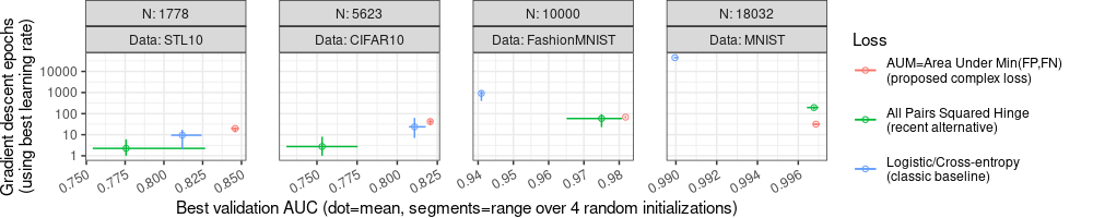
In the plot above, we again see Best validation AUC on the X axis, and we see number of epochs on the Y axis. So we can see that the AUM loss has largest Best validation AUC (so AUM can be more accurate), as well as comparable/smaller number of epochs (so AUM can be faster).
The plot above uses facet_grid which forces the Y axis to be the
same in each plot, even though we specified scales="free" (which
actually only affects the X axis in this case). Below we use
facet_wrap instead, in order to zoom in on the details of each
panel:
ggplot()+
  theme_bw()+
  theme(
    plot.margin=grid::unit(c(0,1,0,0), "lines"),
    legend.key.spacing.y=grid::unit(1, "lines"),
    axis.text.x=element_text(angle=30, hjust=1),
    panel.spacing=grid::unit(1.5, "lines"))+
  geom_point(aes(
    auc_mean, step_number_mean,
    color=Loss),
    shape=1,
    data=best.wide)+
  geom_segment(aes(
    auc_min, step_number_mean,
    color=Loss,
    xend=auc_max, yend=step_number_mean),
    data=best.wide)+
  geom_segment(aes(
    auc_mean, step_number_min,
    color=Loss,
    xend=auc_mean, yend=step_number_max),
    data=best.wide)+
  facet_wrap(~N+Data, nrow=1, labeller=label_both, scales="free")+
  scale_y_log10(
    "Gradient descent epochs\n(using best learning rate)")+
  scale_x_continuous(
    "Best validation AUC (dot=mean, segments=range over 4 random initializations)")
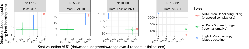
The plot above has a different Y axis for each panel/facet, due to facet_wrap(scales="free").
This allows us to zoom in to see more detailed comparisons in each panel/facet.
However there are a couple of details worth fixing, for improved clarity:
- The default color scale in ggplot2 results in a blue and green which can be difficult to distinguish, so I recommend using Cynthia Brewer’s color palettes, such as Dark2.
- Some data/segments go outside the range of the Y axis ticks, which
can make the Y axis difficult to read, so we can use
geom_blankto increase the Y axis range.
dput(RColorBrewer::brewer.pal(3,"Dark2"))
## c("#1B9E77", "#D95F02", "#7570B3")
loss.colors <- c("black", "#D95F02", "#7570B3")
names(loss.colors) <- loss2show
p <- function(Data,x,y)data.table(Data,x,y)
(blank.Data <- rbind(
  p("CIFAR10",0.8,100),
  p("MNIST",0.99,c(10,100000)),
  p("STL10",0.8,30)))
##       Data     x     y
##     <char> <num> <num>
## 1: CIFAR10  0.80 1e+02
## 2:   MNIST  0.99 1e+01
## 3:   MNIST  0.99 1e+05
## 4:   STL10  0.80 3e+01
(blank.Data.N <- best.wide[, .(N,Data)][blank.Data, on=.(Data), mult="first"])
##        N    Data     x     y
##    <int>  <char> <num> <num>
## 1:  5623 CIFAR10  0.80 1e+02
## 2: 18032   MNIST  0.99 1e+01
## 3: 18032   MNIST  0.99 1e+05
## 4:  1778   STL10  0.80 3e+01
ggplot()+
  theme_bw()+
  theme(
    plot.margin=grid::unit(c(0,1,0,0), "lines"),
    legend.key.spacing.y=grid::unit(1, "lines"),
    axis.text.x=element_text(angle=30, hjust=1),
    panel.spacing=grid::unit(1.5, "lines"))+
  geom_blank(aes(x, y), data=blank.Data.N)+
  geom_point(aes(
    auc_mean, step_number_mean,
    color=Loss),
    shape=1,
    data=best.wide)+
  geom_segment(aes(
    auc_min, step_number_mean,
    color=Loss,
    xend=auc_max, yend=step_number_mean),
    data=best.wide)+
  geom_segment(aes(
    auc_mean, step_number_min,
    color=Loss,
    xend=auc_mean, yend=step_number_max),
    data=best.wide)+
  facet_wrap(~N+Data, nrow=1, labeller=label_both, scales="free")+
  scale_color_manual(
    values=loss.colors)+
  scale_y_log10(
    "Gradient descent epochs\n(using best learning rate)")+
  scale_x_continuous(
    "Best validation AUC (dot=mean, segments=range over 4 random initializations)")
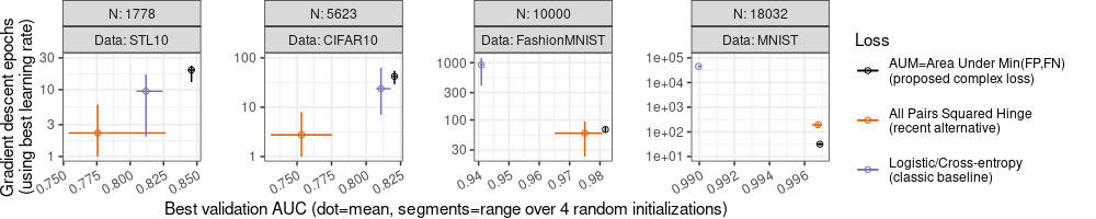
Note above how the Y axes have expanded, and now there are tick marks above the range of the data/segments, which makes the Y axis easier to read. Also the color legend has changed: I use black for the proposed method, and two other colors from Cynthia Brewer’s Dark2 palette.
Conclusions
Our goal was to explore how machine learning error/accuracy rates can be visualized, in order to compare different algorithms. We discussed various techniques for creating visualizations that make it easy for the reader to compare different algorithms.
Session info
sessionInfo()
## R Under development (unstable) (2024-11-11 r87319 ucrt)
## Platform: x86_64-w64-mingw32/x64
## Running under: Windows 11 x64 (build 22631)
##
## Matrix products: default
##
##
## locale:
## [1] LC_COLLATE=English_United States.utf8  LC_CTYPE=English_United States.utf8    LC_MONETARY=English_United States.utf8
## [4] LC_NUMERIC=C                           LC_TIME=English_United States.utf8
##
## time zone: America/Toronto
## tzcode source: internal
##
## attached base packages:
## [1] stats     graphics  utils     datasets  grDevices methods   base
##
## other attached packages:
## [1] ggplot2_3.5.1      data.table_1.16.99
##
## loaded via a namespace (and not attached):
##  [1] vctrs_0.6.5        cli_3.6.3          knitr_1.49         rlang_1.1.4        xfun_0.49          generics_0.1.3
##  [7] glue_1.8.0         labeling_0.4.3     colorspace_2.1-1   scales_1.3.0       fansi_1.0.6        grid_4.5.0
## [13] munsell_0.5.1      evaluate_1.0.1     tibble_3.2.1       lifecycle_1.0.4    compiler_4.5.0     dplyr_1.1.4
## [19] RColorBrewer_1.1-3 pkgconfig_2.0.3    farver_2.1.2       R6_2.5.1           tidyselect_1.2.1   utf8_1.2.4
## [25] pillar_1.9.0       magrittr_2.0.3     tools_4.5.0        withr_3.0.2        gtable_0.3.5