Positive and negative log transform
diverging color heat map
I recently used the following code/transformation to make an informative plot of linear model coefficients,
normalize <- function(x)(x-min(x))/(max(x)-min(x))
log.pos.neg <- function(x)sign(x)*normalize(log10(abs(x)))
curve(log.pos.neg(x),-9,9.1)
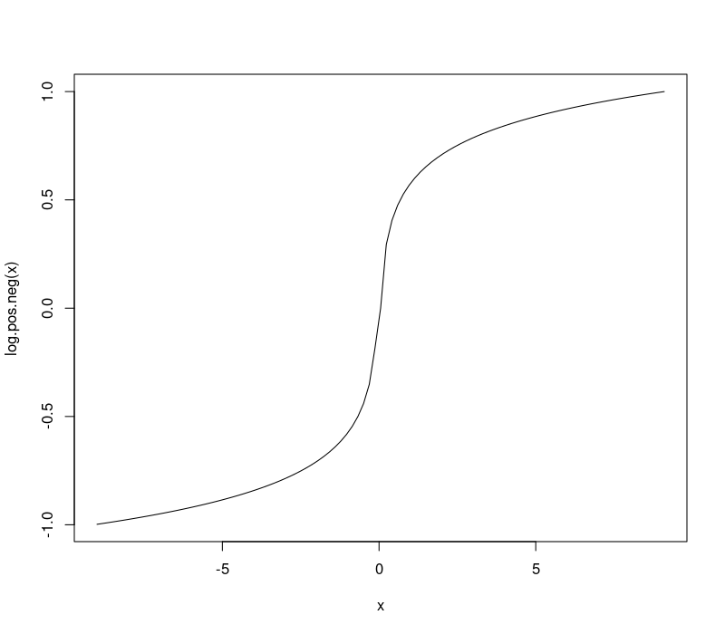
This curve is a nonlinear transformation which makes it easy to visualize log-scale changes in both positive and negative numbers, so is ideal for a diverging color scale.
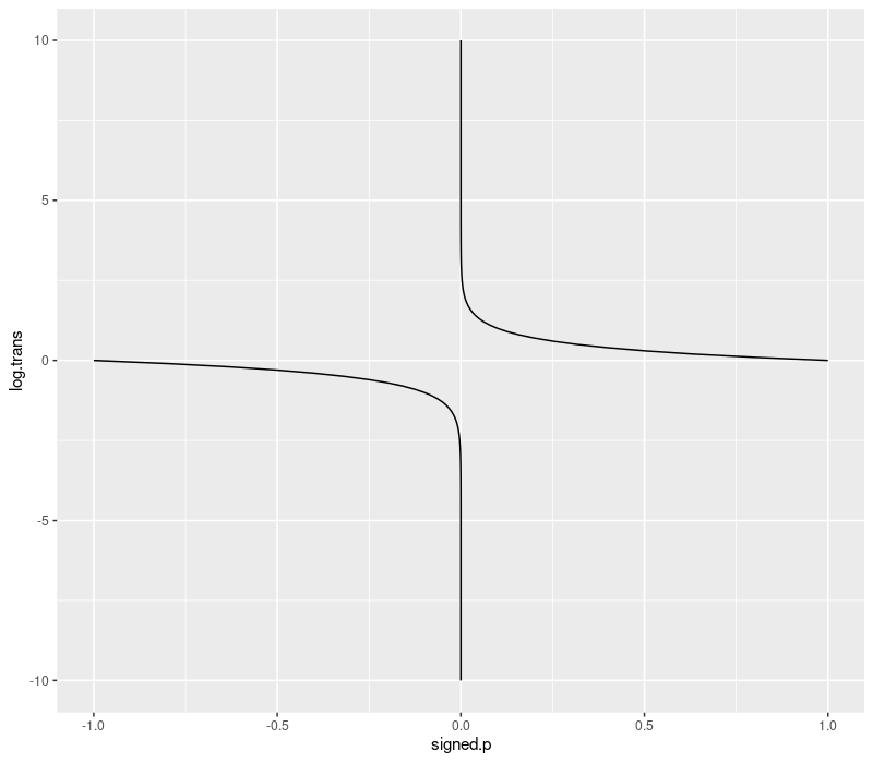
signed p-value transform
When you do a 2-sided t.test in R, for example to see if a machine learning
algorithm is more/less accurate than another, you get two things:
estimateis the effect size,p.valueis the p-value, probability of observing these data/differences, given the null hypothesis.
So you can have a really big difference, in either the positive or
negative direction (one or the other algorithm is quite a bit more
accurate), and the p-values will be small (1e-10 maybe). The
p-value by itself does not tell you which direction the differences
are tending, so for visualization we can multiply the p-value by the
sign of the difference, and use the transformation below to transform
into log scale. This enables us to visualize differences between very
small/significant p-values such as 1e-8 and 1e-9 which would not
be visible on the linear scale (without this transformation).
library(data.table)
p.val <- 10^seq(-10, 0, l=101)
signed.p <- sort(c(sapply(c(-1,1), function(s)s*p.val)))
log.signed.p <- function(signed.p){
  sign(signed.p)*abs(log10(abs(signed.p)))
}
sign.dt <- data.table(signed.p, log.trans=log.signed.p(signed.p))
library(ggplot2)
ggplot()+
  geom_line(aes(
    signed.p, log.trans, group=sign(signed.p)),
    data=sign.dt)