Customizable defaults for Positioning Functions
Normally sensible default label positions are chosen for you
automatically when you call direct.label(p) with a
plot p. But what if you don't like the defaults? For
individual plots you can always specify a particular Positioning
Function f by using the second
argument: direct.label(p,f).
But what if you consistently think that the default choice is bad,
and you would like to redefine it once and for all? You can define a
custom function that chooses the default direct label positions, in
the following manner. Put the following code in your ~/.Rprofile, and
edit it to reflect your desired defaults for lattice and/or ggplot2
plots:
options(
directlabels.defaultpf.trellis=function(lattice.fun.name,groups,type,...){
  ldefault <- if(nlevels(groups)==2)"lines2" else "maxvar.points"
  switch(lattice.fun.name,
         dotplot=ldefault,
         xyplot=switch(type,p="smart.grid",ldefault),
         densityplot="top.points",
         qqmath=ldefault,
         rug="rug.mean",
         stop("No default direct label placement method for '",
              lattice.fun.name,"'.\nPlease specify method."))
},
directlabels.defaultpf.ggplot=function(geom,...){
  switch(geom,
    density="top.points",
    line="maxvar.points",
    point="empty.grid.2",
    path="bottom.points",
    stop("No default label placement for this type of ggplot."))
})
Labeling several positions
What if it makes sense to put a group label at more than one place
for increased clarity? Then all you have to do is construct a
Positioning Function that returns several rows for each group.
A special case: if you want to combine the output from several
existing Positioning Functions, there is a shortcut function that can
help! dl.combine
is included in the directlabels package, and it works like this:
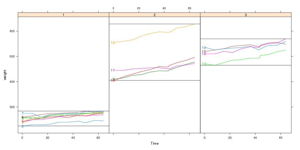
data(BodyWeight,package="nlme")
library(lattice)
P <- xyplot(weight~Time|Diet,BodyWeight,groups=Rat,type="l",layout=c(3,1))
library(directlabels)
direct.label(P,dl.combine(first.points,last.qp))
See also: example(dl.combine)
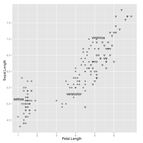
Labeling black and white plots for printout
library(lattice)
trellis.par.set(standard.theme(color=FALSE))
p <- xyplot(jitter(Sepal.Length)~jitter(Petal.Length),iris,groups=Species)
direct.label(p)
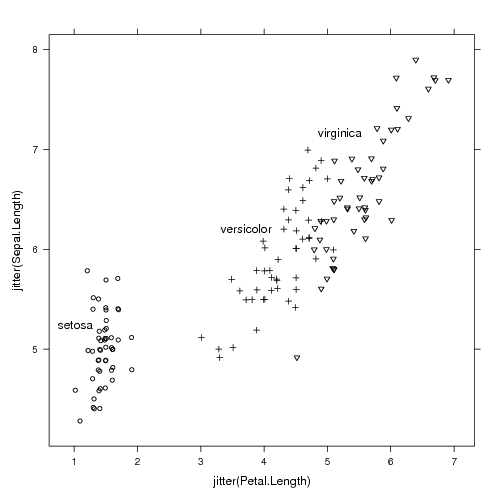
|
library(ggplot2)
ggplot(iris,aes(Petal.Length,Sepal.Length))+
  geom_point(aes(shape=Species))+
  geom_dl(aes(label=Species),method="smart.grid")+
  scale_shape_manual(values=c(setosa=1,virginica=6,versicolor=3),guide="none")
|
See also: example(geom_dl)
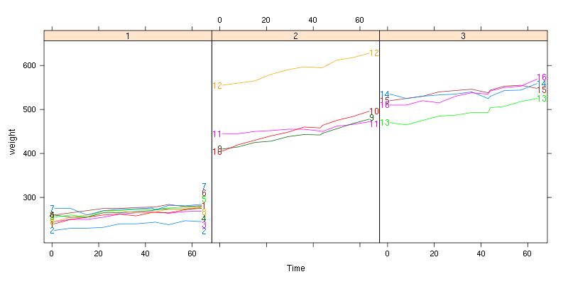
Custom panel and panel.groups functions for the rat body weight data
If you want to use a custom display in lattice panels, you need to
write a custom panel or panel.groups function. For something you want
to draw once for each panel, use a custom panel function, and for
something that you want to draw for each group, use a custom
panel.groups function. When you use a custom panel.groups function,
you need to explicitly specify the Positioning Function for the direct
labels. This series of examples should should illustrate how to
effectively create custom direct labeled displays.
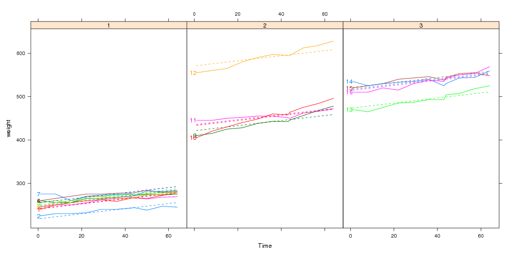
library(directlabels)
data(BodyWeight,package="nlme")
## Say we want to use a simple linear model to explain rat body weight:
fit <- lm(weight~Time+Diet+Rat,BodyWeight)
bw <- fortify(fit,BodyWeight)

## Custom panel function which highlights min and max values:
panel.range <- function(y,...){
  panel.abline(h=range(y))
  panel.superpose(y=y,...)
}
direct.label(xyplot(weight~Time|Diet,bw,groups=Rat,type="l",
                    layout=c(3,1),panel=panel.range))
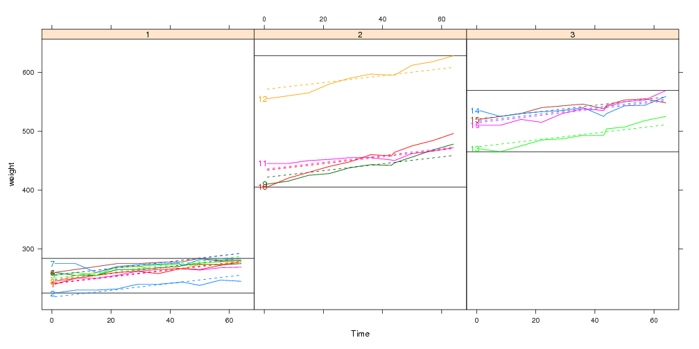
## This panel.groups function will display the model fits:
panel.model <- function(x,subscripts,col.line,...){
  panel.xyplot(x=x,subscripts=subscripts,col.line=col.line,...)
  llines(x,bw[subscripts,".fitted"],col=col.line,lty=2)
}
x <- xyplot(weight~Time|Diet,bw,groups=Rat,type="l",layout=c(3,1),
            panel=panel.superpose,panel.groups=panel.model)
direct.label(x,"first.points")
## Custom panel and panel.groups functions:
x <- xyplot(weight~Time|Diet,bw,groups=Rat,type="l",layout=c(3,1),
            panel=panel.range,panel.groups=panel.model)
direct.label(x,"first.points")
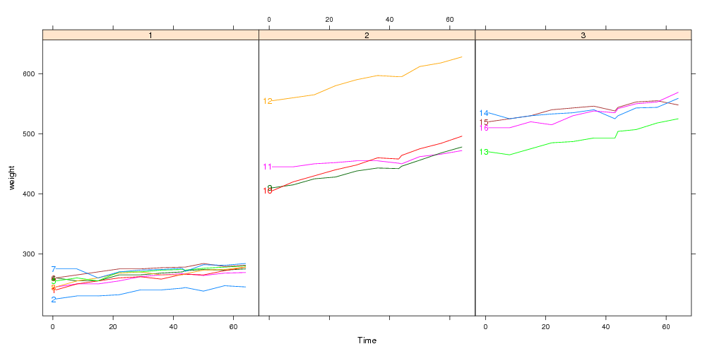
Using the panel.superpose.dl panel function
The panel.superpose.dl function can be used in place of
panel.superpose in your lattice plots. It behaves just like
panel.superpose, but it intelligently adds direct labels. If you
specify panel.groups as a character rather than a function, then we
can guess a Positioning Function. If not, you can always specify a
Positioning Function with the method= argument.
xyplot(weight~Time|Diet,bw,groups=Rat,type="l",layout=c(3,1),
       panel=panel.superpose.dl,panel.groups="panel.xyplot")
Here we use a custom panel.groups function so the Positioning
Function must be specified using the method= argument:
xyplot(weight~Time|Diet,bw,groups=Rat,type="l",layout=c(3,1),
       panel=panel.superpose.dl,panel.groups=panel.model,method="first.points")
Specifying the positioning method as a list
Since the input and output of a Positioning Function is the same
sort of data frame, you can chain Positioning Functions together. To
illustrate how this works, consider the following contrived
example:
complicated <- list(dl.trans(x=x+1), ## shift every point to the right 1cm
                    gapply.fun(d[-2,]), ## delete the 2nd point of every group
                    rot=c(30,180)) ## rotate by alternately 30 and 180 degrees
direct.label(dotplot(VADeaths,type="o"),complicated)
When method is specified as a list, the arguments will be applied
in sequence, starting from the data frame of all plotted points. In
this example,
- In Positioning Methods the x and y units are centimeters on the
plotting device. The first list element dl.trans(x=x+1) is a
function that adds 1 to every x value, and has the effect of shifting
the labels to the right 1cm.
- The second element is a call to gapply.fun, which lets
you specify an expression to apply to each group, as a function of the
data d. In this case d[-2,] means delete the second
row from each group.
- Named elements are copied to the data frame, so the third element,
rot=c(30,180), adds a rot column to the data.frame,
with values 30 and 180 for every other row. This has the effect of
rotating every label by 30 or 180 degrees. Text display parameters
alpha, fontsize, fontfamily,
fontface, lineheight, and cex can also be
specified in this manner (see the help pages for grid::gpar
for an exhaustive description and directlabels::dlcompare for
an example).
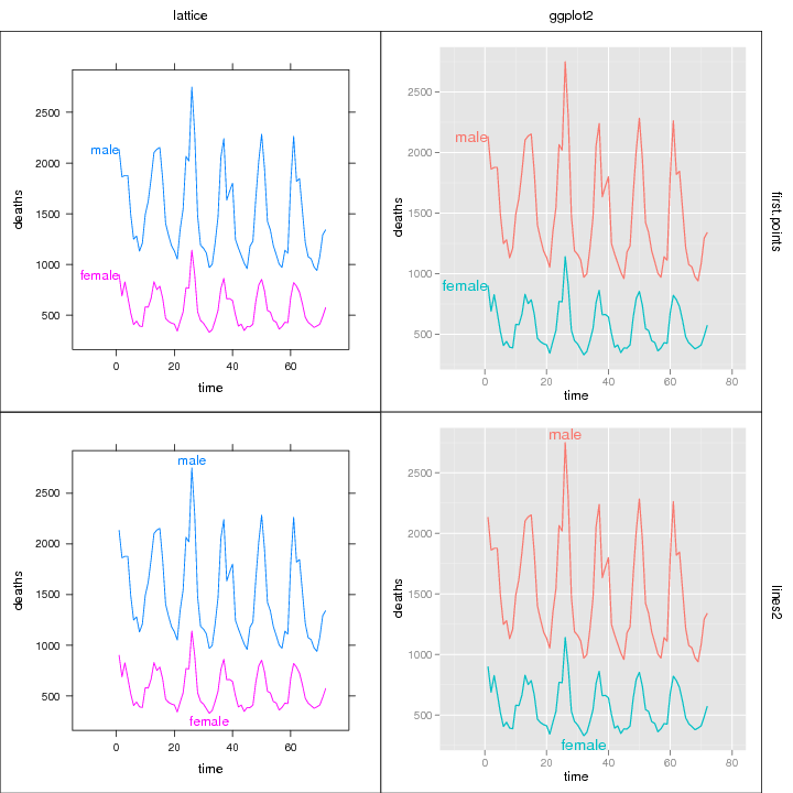
Compare several plots and methods
Several different labeling methods can be compared for any mix of
ggplot2 and/or lattice plots.
library(directlabels)
library(reshape2)
dts <- cbind(male=mdeaths,female=fdeaths,time=1:length(mdeaths))
ddf <- melt(as.data.frame(dts),id="time")
names(ddf) <- c("time","sex","deaths")
plots <- list(lattice=
              xyplot(deaths~time,ddf,groups=sex,type="l",xlim=c(-15,80)),
              ggplot2=
              qplot(time,deaths,data=ddf,colour=sex,geom="line")+xlim(-10,80))
dlcompare(plots,list("first.points","lines2"))